April 15, 2009
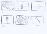
Wednesday – The Coke Zero Storyboarding
This is the storyboarding for Coke Zero tcv shoot.
The exploration on the animation & camera shoot

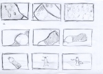


COKE zero_concept & moodboard
Here is the concept about coke zero that is made possible, showing the impossibility made possible through the play of anti-gravity.
In the start, it shows close-up of a world (characters that look like ingredients of COKE zero dwelling there) then camera will zoom showing a character itself and its behaviour.
Then as the characters moves in its world-it looks up seeing something interesting, the camera will slowly pull out showing that there are 2 worlds (the liquid and the gaseous)


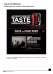
Updates
Today we will be doing a test shoot to see whether we can get the look that we want for our concept. We planned out the whole sequence of the shoot and also went further to research on the style of the whole look, the element ex.bubbles and the background.
The comments given for my refined version of the two logos:
H1 is the better logo – it has the right colour and feel. However, the letters ‘NYP’ are not prominent enough. Also, the combination of the eliptical shape plus the bubbles makes the logo look like a Redoxon pill bubbling in a glass of water :). I suggest tweaking the logo to look more like a frisbee with the letters ‘NYP’ embossed more prominently on it (it will be more fun for animation later too). Please also incorporate the letters ‘TV’ in the logo. Perhaps try using a flourescent tube-like font for ‘TV’.
So this is the lastest refined version of the NYP TV Logo I did.

